Your Studio Photographer in Westchester, NY for Creative Art Direction, Branding, Set Building, Advertising, and more.
Savor the Sweet Moments: Julie Benedetto's Delectable Sweet Photography
RAW REV
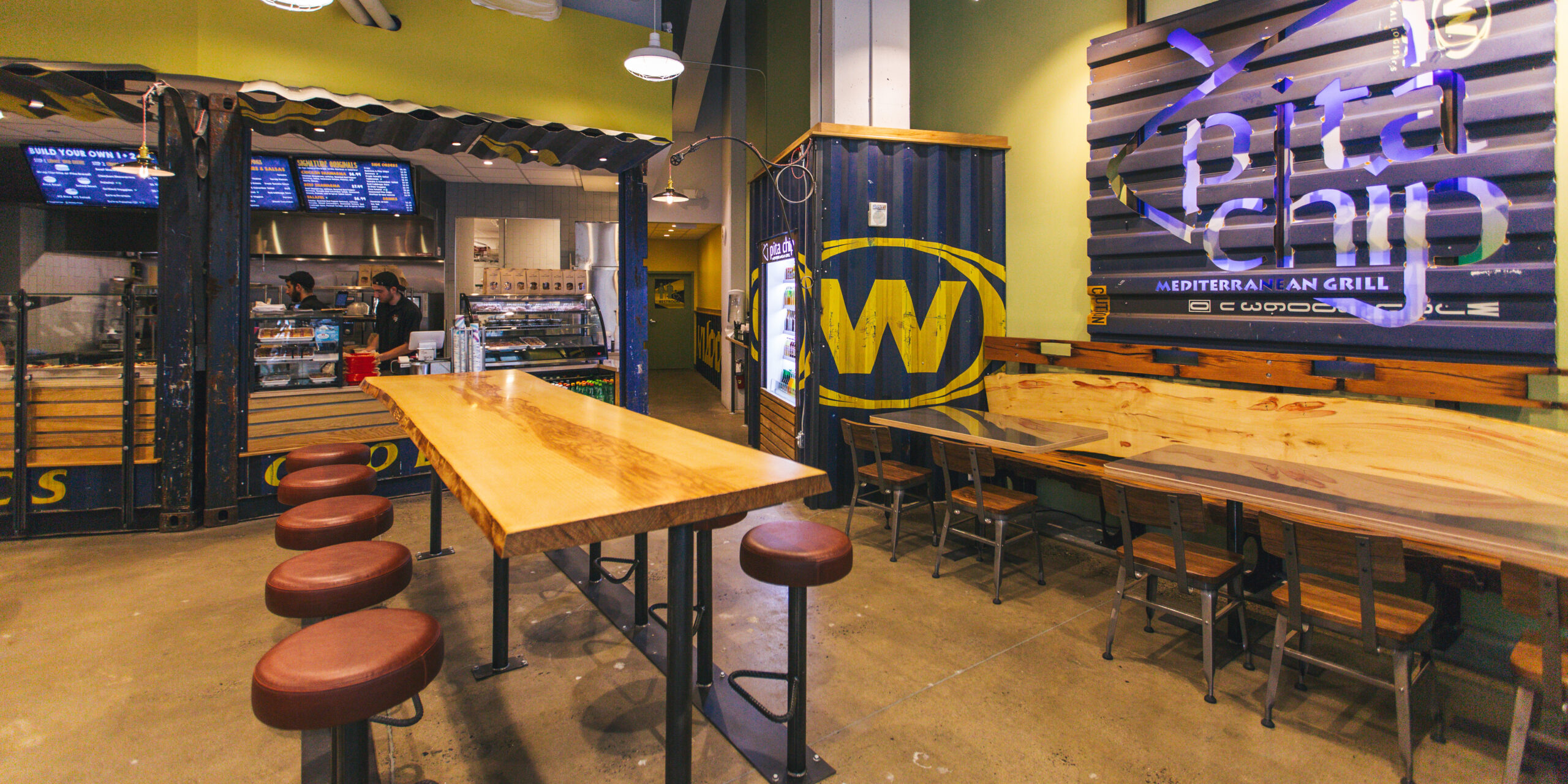
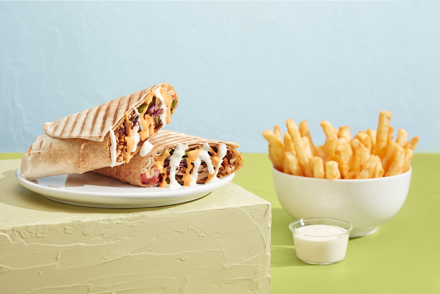
Client: Pita Chip
Scope: Branding, Identity, Art Direction, Set Build, Prop Fabrication, Photography and Post Production.
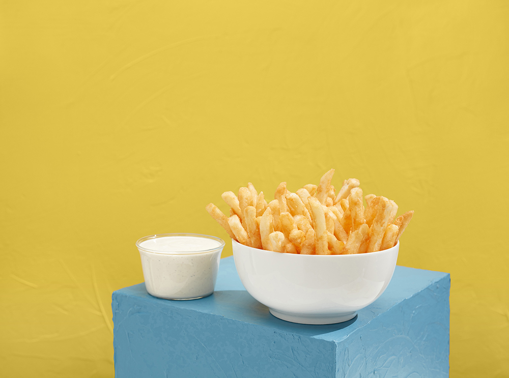
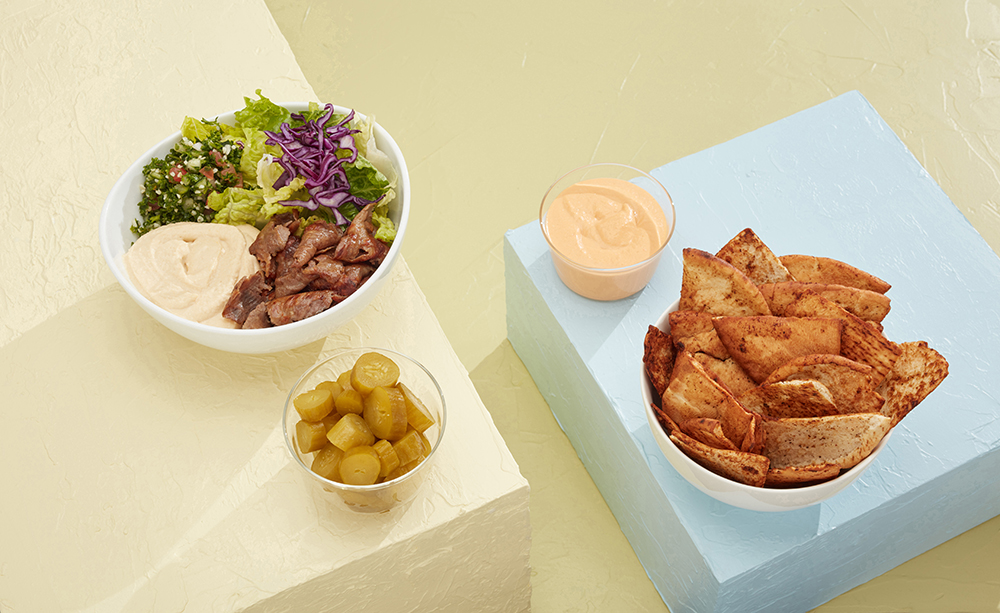
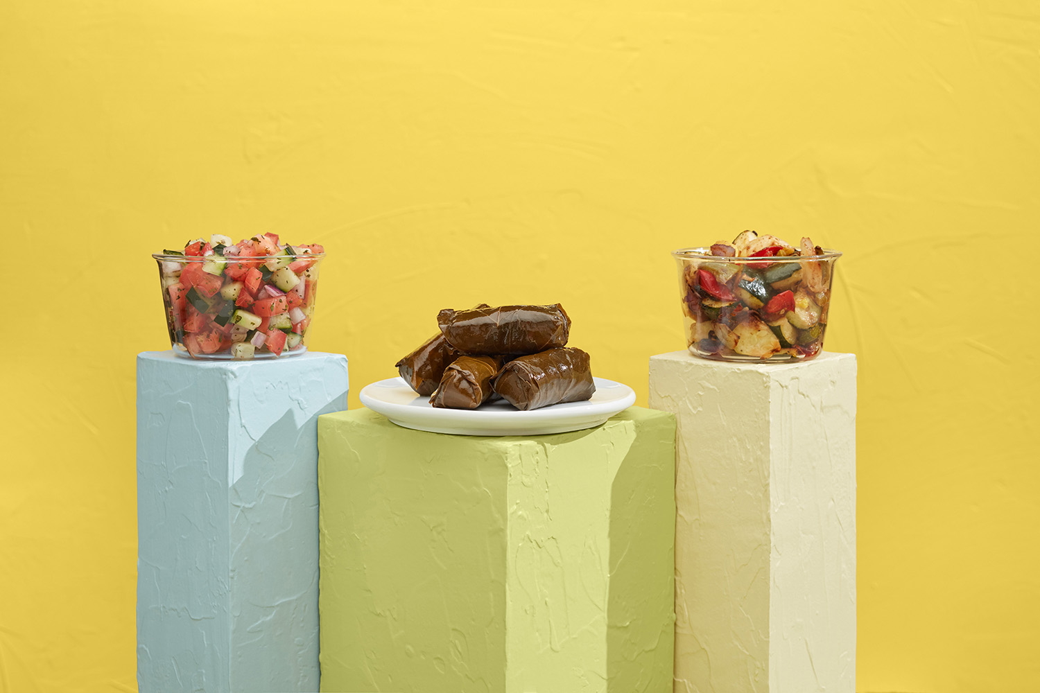
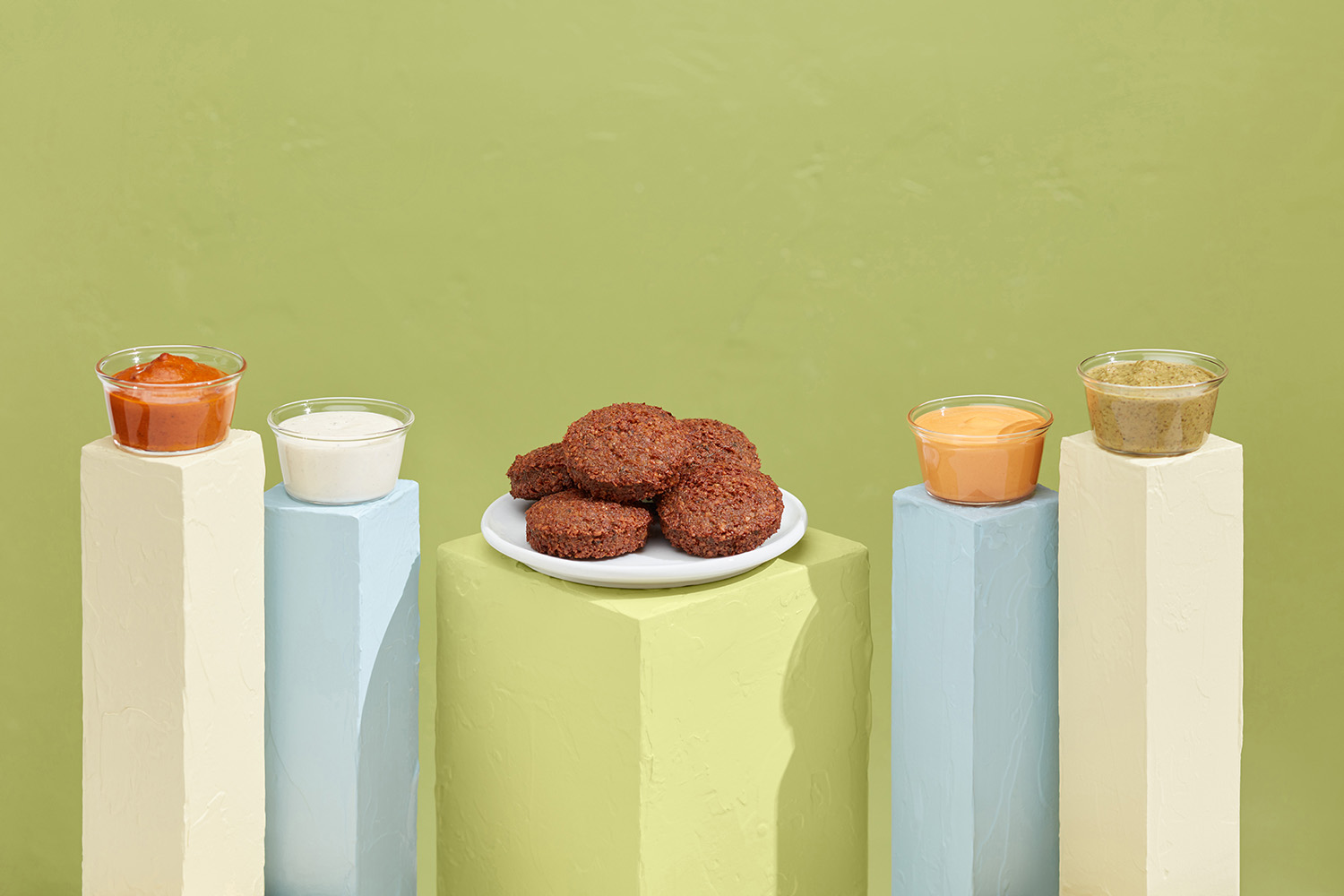
Challenge: Pita Chip needed new heroic images of their popular menu items for local advertising campaigns. We focused on the simple modern set design to present the food in a heroic way. With a mediterranean menu, we decided on bright, colorful and sunny feeling.
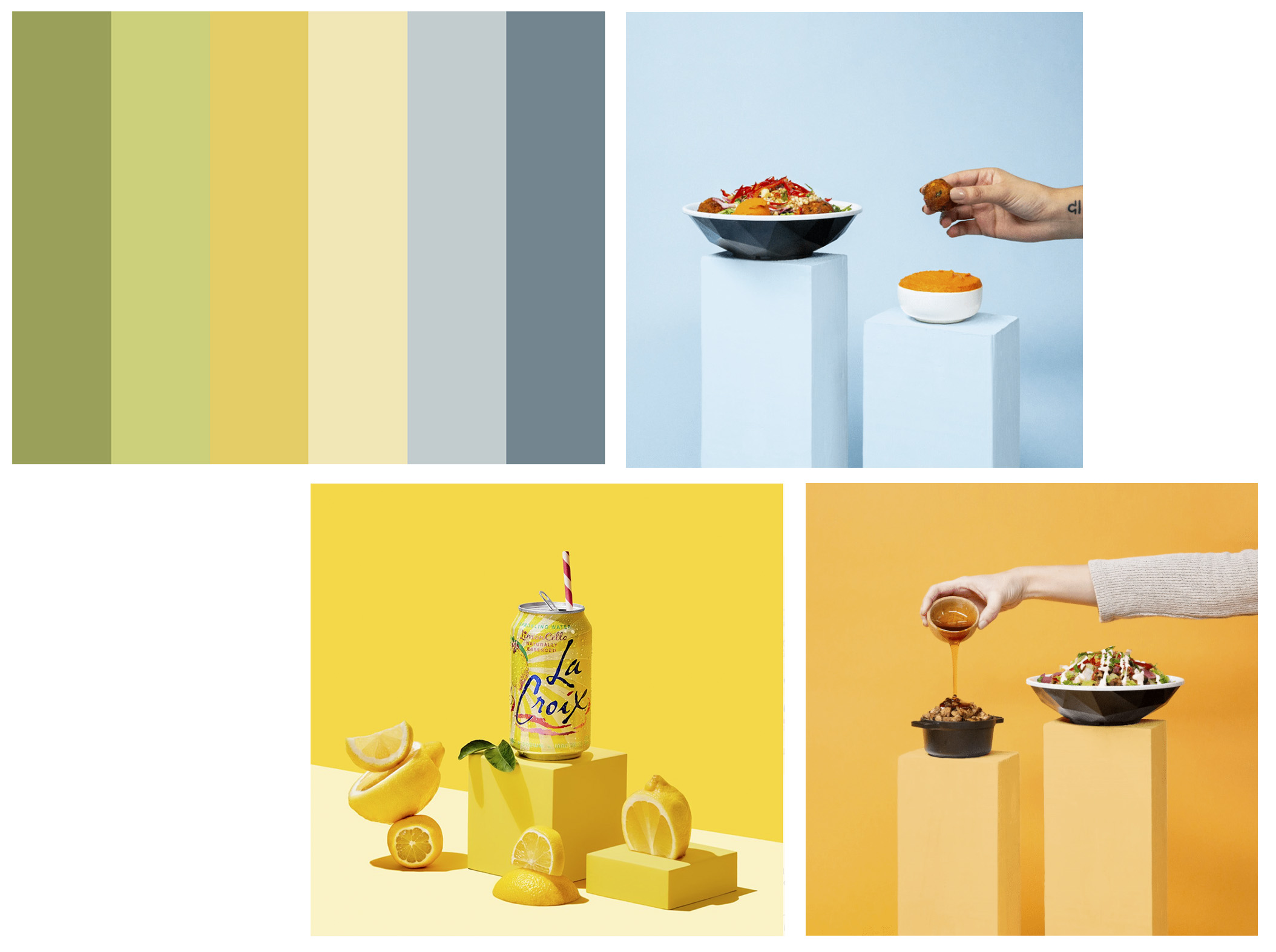
COLOR PALETTE
Existing Colors
Added Colors
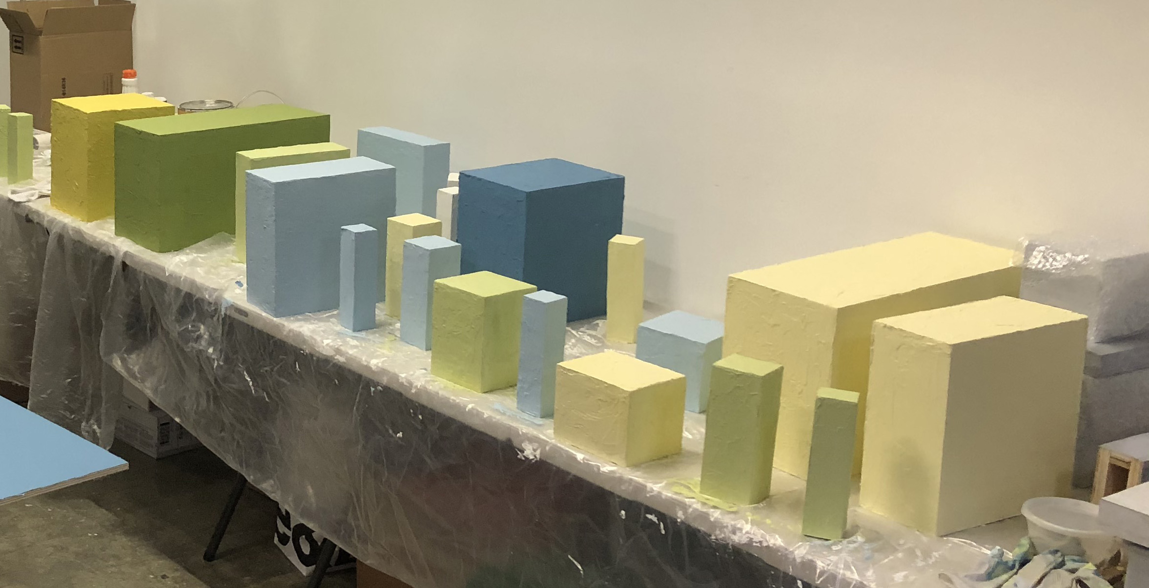
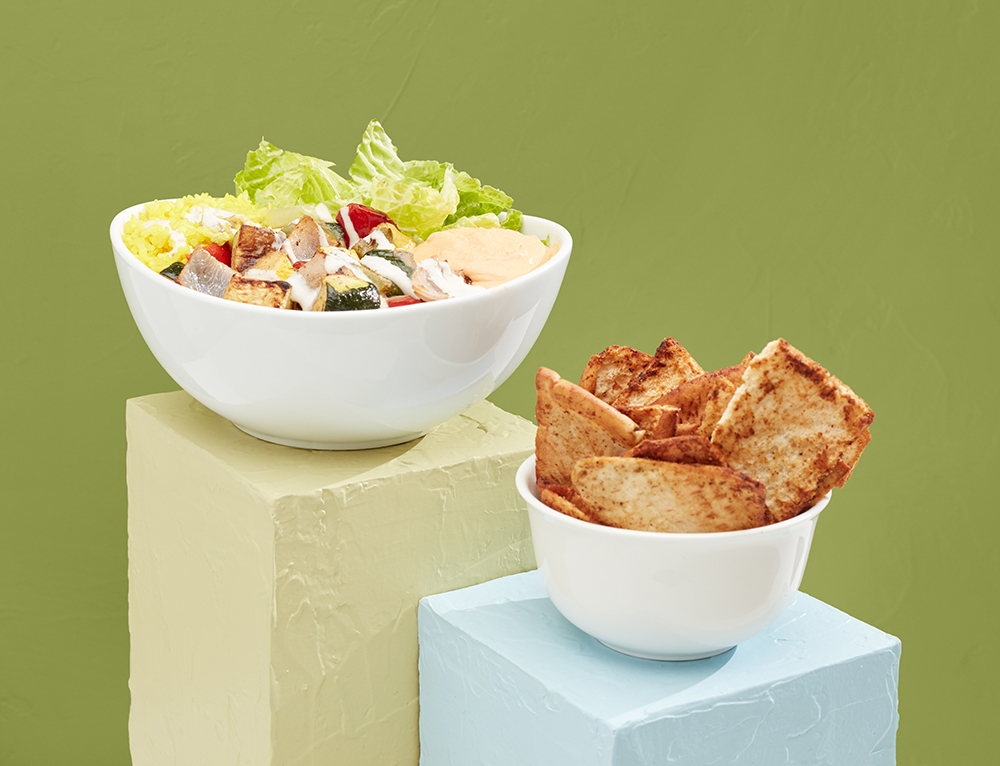
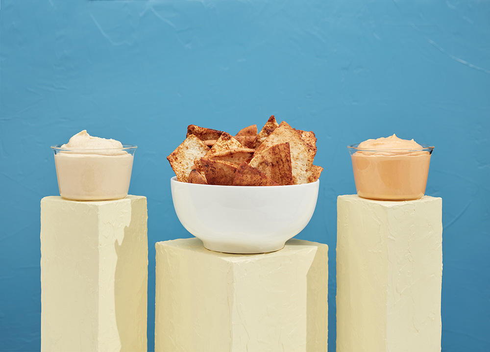
A vibrant color palette was meticulously developed to transform their existing colors into a bright spring and summer mood. The existing greens and yellows were skillfully combined with Mediterranean blues and a soft yellow to achieve a fresh and inviting new look. This carefully curated color scheme brought a renewed sense of energy and vibrancy to the brand.
The new branding content we created with these solid color blocks was not only visually appealing but also strategically designed to catch the attention of locals in the area. The bold and harmonious color combinations effectively highlighted the brand’s identity, making it stand out in a competitive market.
By integrating these fresh colors into the branding materials, we were able to create a strong visual impact that resonated with the target audience. The bright spring and summer palette evoked feelings of warmth and positivity, aligning perfectly with the brand’s vision and mission.
The transformation of the color palette played a crucial role in enhancing the brand’s overall aesthetic appeal, making it more attractive and memorable to both existing and potential customers. This strategic rebranding effort not only refreshed the brand’s image but also reinforced its position as a contemporary and dynamic player in the market.
MOOD BOARD
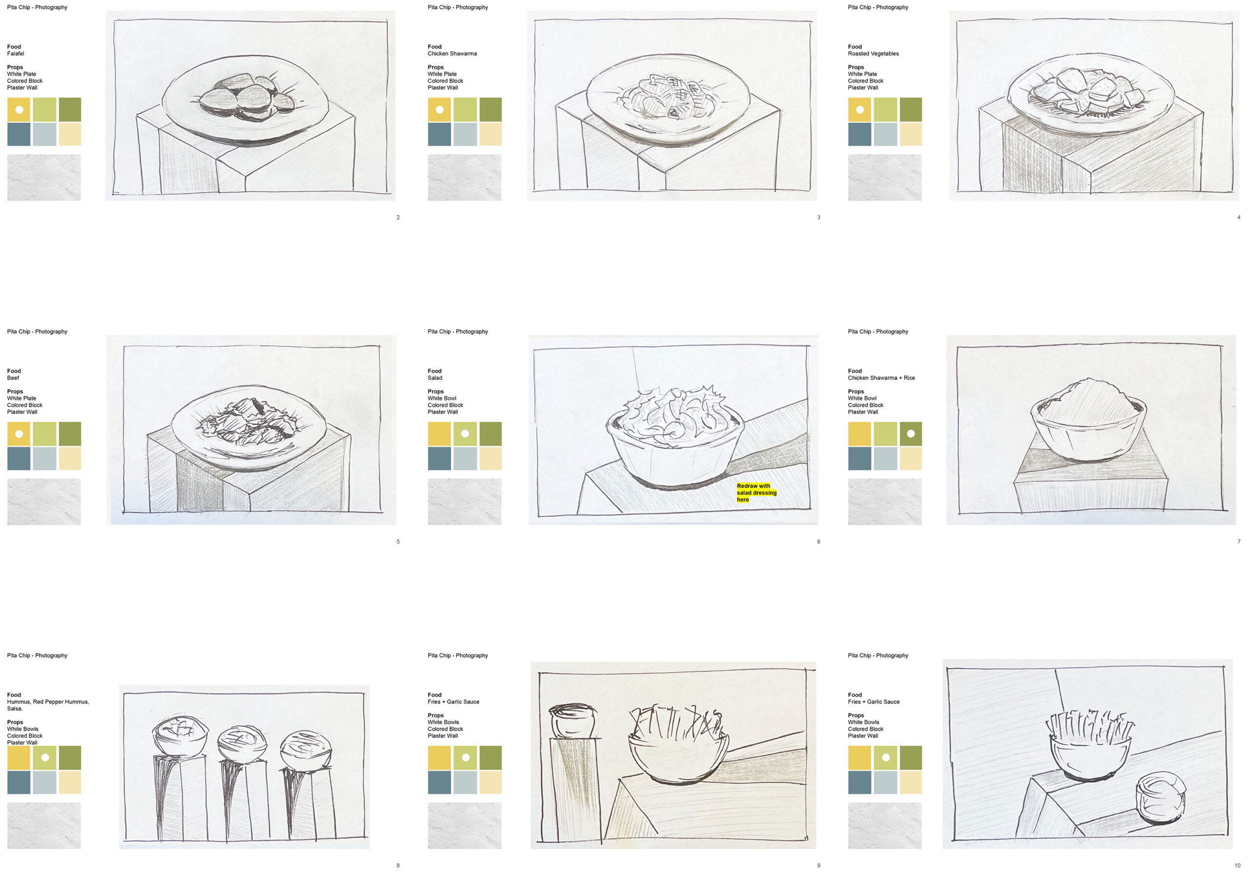
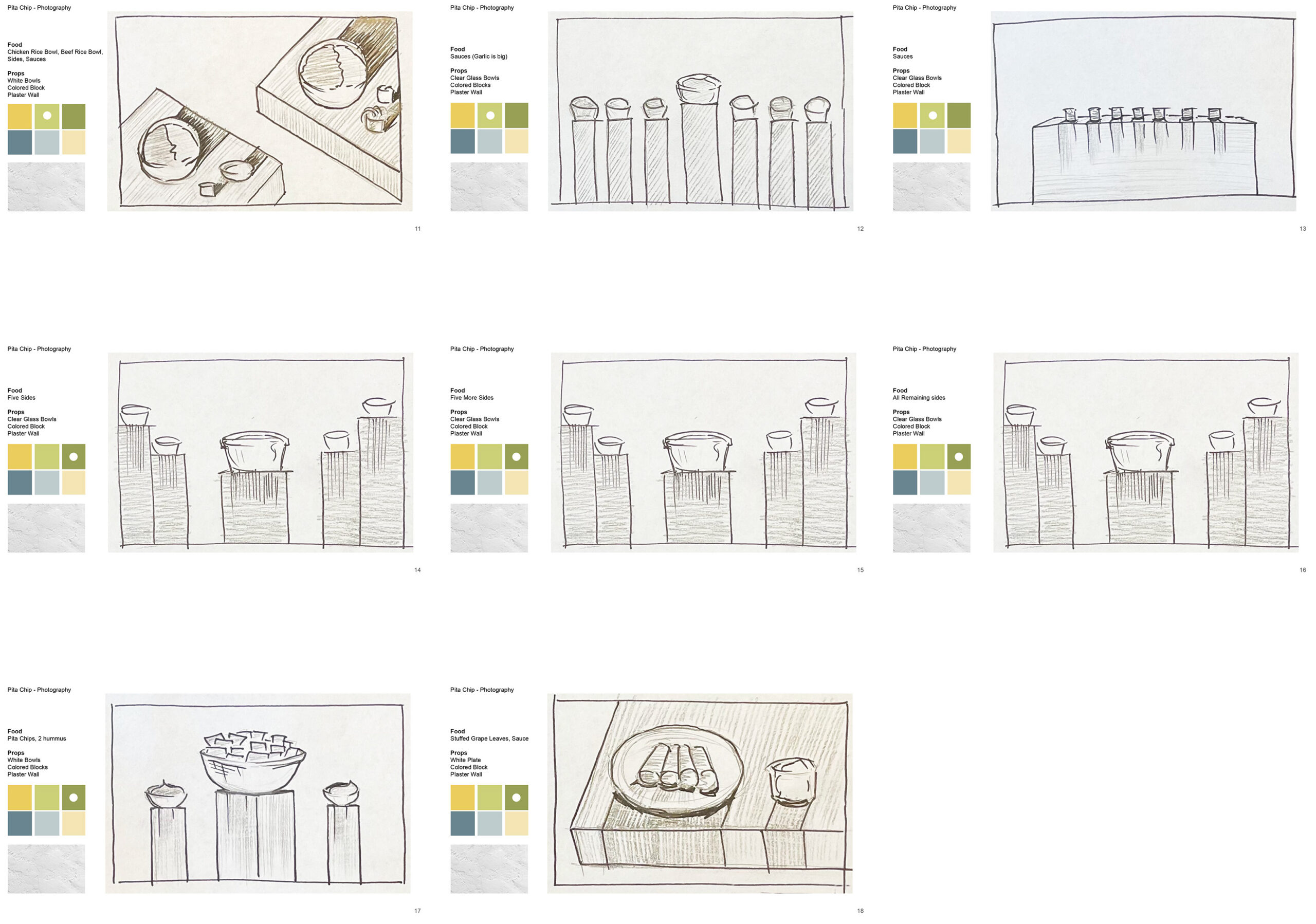
PROP FABRICATION
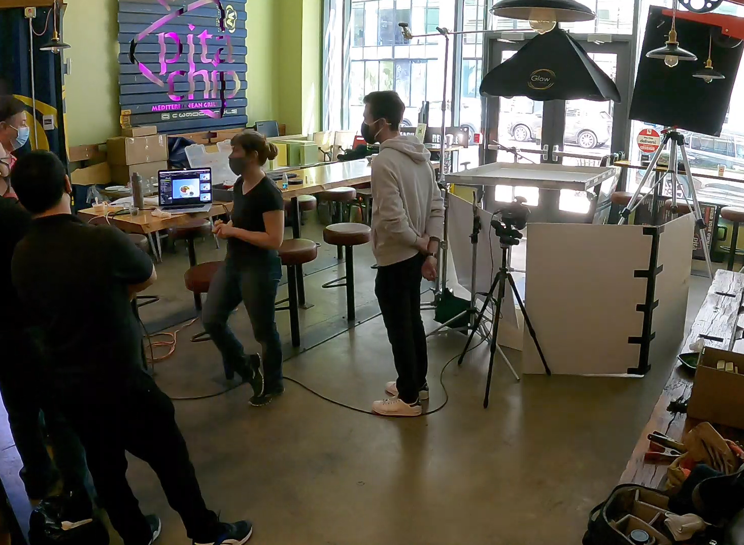
We chose to shoot at the restaurant to ensure the food appeared as authentically as it is prepared for customers. This decision was crucial in showcasing the restaurant’s culinary expertise and the true quality of their dishes. We transported backgrounds, props, and surfaces to the restaurant, meticulously recreating the perfect setting for our food photography shoot. The beautifully presented food made my job as a food photographer much easier, and very little post-production was needed because the dishes were natural and healthy straight from the kitchen.
After the launch of the restaurant’s rebrand, the client noticed a significant increase in both in-store and delivery sales. The new visual identity played a pivotal role in this success. By simplifying and speeding up the ordering process, it attracted students and working professionals in the area. This rebranding strategy, focused on enhancing the user experience, proved to be highly effective.
As a recognizable brand in the local community, the restaurant has become a popular new go-to spot for lunch and dinner. The super healthy and tasty menu is particularly appealing to athletes and health-conscious customers who are looking for quick, nutritious grab-and-go meals. This emphasis on health and convenience has solidified the restaurant’s reputation as a top choice for quality dining in the area.